According to Grand View Research, the automotive wrap films market size reached $4.76 billion in 2021 worldwide. Researchers expect this market to grow at a compound annual growth rate of 22.2% from 2022 to 2030. A custom vehicle wrap design provides a consumer-friendly way of advertising. Besides, you can easily change your vehicle wrap materials. So, you won`t worry about getting a new vehicle or fleet of cars for your advertising. Despite the many benefits, car owners still make various vehicle wrap design mistakes. This article provides you with five vehicle wrap design mistakes and how you can avoid them.

1. Missing Your Brand Identity
When designing your vehicle wrap, you want to increase awareness of your brand identity and attract new customers. There are various ways you can forget to brand your vehicle wrap.
For instance, you may forget to include the name and logo of your business. Others include the name and logo in the vehicle wrap design but don`t use the company`s signature color scheme and style.
Ensure you design your vehicle wrap to provide a comprehensive outlook of your business. That way, new customers will know how to identify your business products and services uniquely.
2. Using Low Contrast Wrap Colors and Graphics
Using low contrast designs like a white or gray text on a white background might look pretty. Still, such wrap design ideas can be challenging to interpret.
This will mostly happen when a person has limited time to engage with and analyze the text.
To get the best results, stick to high-contrast color schemes. For a white background, opt for a dark color for the texts.
Similarly, you can use light or bright colors if you choose a dark background.
3. Ignoring the Roof Design
Most people will argue that an individual driving or walking by your vehicle won’t be able to see the roof. To some extent, that’s true, especially when wrapping a large automobile like a cargo van.
Even so, your vehicle’s roof can still be a significant part of your vehicle wrap design. When parked in front of a tall building, your vehicle’s roof will be visible to anyone from the second floor.
So, you can include the business name and contact information as part of your roof`s wrap design.
4. Using Illegible Fonts
Your choice of fonts will determine whether or not people can read your vehicle wrap text. It can be hard to deconstruct some fonts while others have handwriting designs.
Ensure you choose fonts that one can read even when driving at high speed past your branded vehicle. Fonts that’ll give you the best results include sans serif, Arial, and Helvetica.
5. Too Much Text
Mostly, people will see your XPEL vehicle wrap while in motion. Your audience can be driving or walking by your car or truck.
So, it`s best to keep your messaging precise, short and sweet.
Your vehicle wrap text should only include the essential information. This includes your brand name and a business slogan or tagline.
You can also include your list of services in bullet form, email address, and business website. Other helpful information includes your business location, contact and a call to action.
Avoiding Vehicle Wrap Design Mistakes
Consulting with a professional can help you avoid many vehicle wrap design mistakes. You can make informed decisions when choosing your vehicle wrap materials with professional advice.
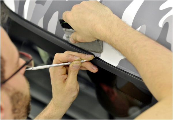
Also, vehicle wrap installation requires specialty tools of work. So, taking the DIY approach can deliver poor and unwanted results.
Explore the rest of this page to learn more vehicle wrap design ideas for you.

